What are computer game graphics?
Computer game graphics entail the following:
-
Print Media Graphics (game poster/packaging)
This is like the face of the game. It’s the art of the game cover, the
game’s poster, game’s website and overall the theme in which the game is
portrayed. This impacts the number of sales – the better the game cover the
more copies you’re going to sell for example. It also makes the audience get
into the game even more.
- In-game
Graphics
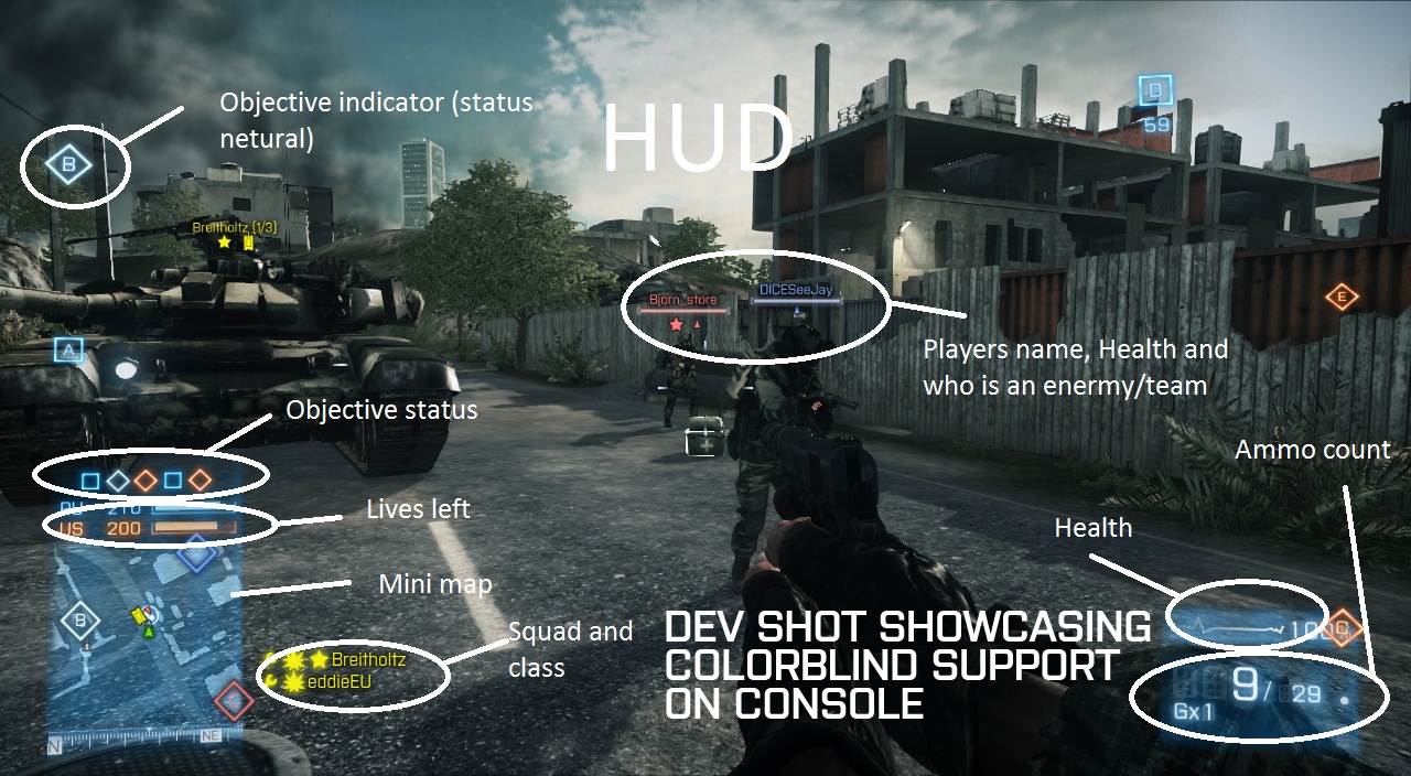
 Head-up
display graphics/in-game interface: it's
all the things that you can possibly interact with in a video-game. From your
HUD to the main menu, mini-map and chat, etc., all the things you can interact
with by clicking or typing, pressing any buttons, etc, that’s the in-game
interface. Here are a couple of examples of in-game interfaces. The image on
the right clearly shows us the main menu of the game, as well as character,
stats, abilities, mini-map, scoreboard and time.
3D Isometric Sprites: 3D isometric sprites are 2D sprites that give the
impression of depth, posed in 3D. For example, World of Warcraft of The Sims,
where you can rotate the camera and see you character in a 3 dimensional
perspective, these games use 3D Isometric Sprites. They are used to add depth.
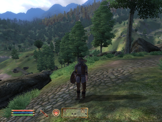
Background graphics: These
are the graphics of all the things that are in the background in a certain
scene – from trees to walls, forests, rain and clouds, etc… These are mainly
static images that you cannot interact with, they are just there to set the
ambience and also so that it wouldn’t just be blank.
Image
textures: Texture art “is
used to describe either the way a three-dimensional work actually feels when touched, or thevisual "feel" of a two-dimensional work.” (http://arthistory.about.com/cs/glossaries/g/t_texture.htm) It’s used to inform the audience of what something
is made of, looks like and feels likes. Textures should be relevant towards the
place, background, storyline and scene of a game.
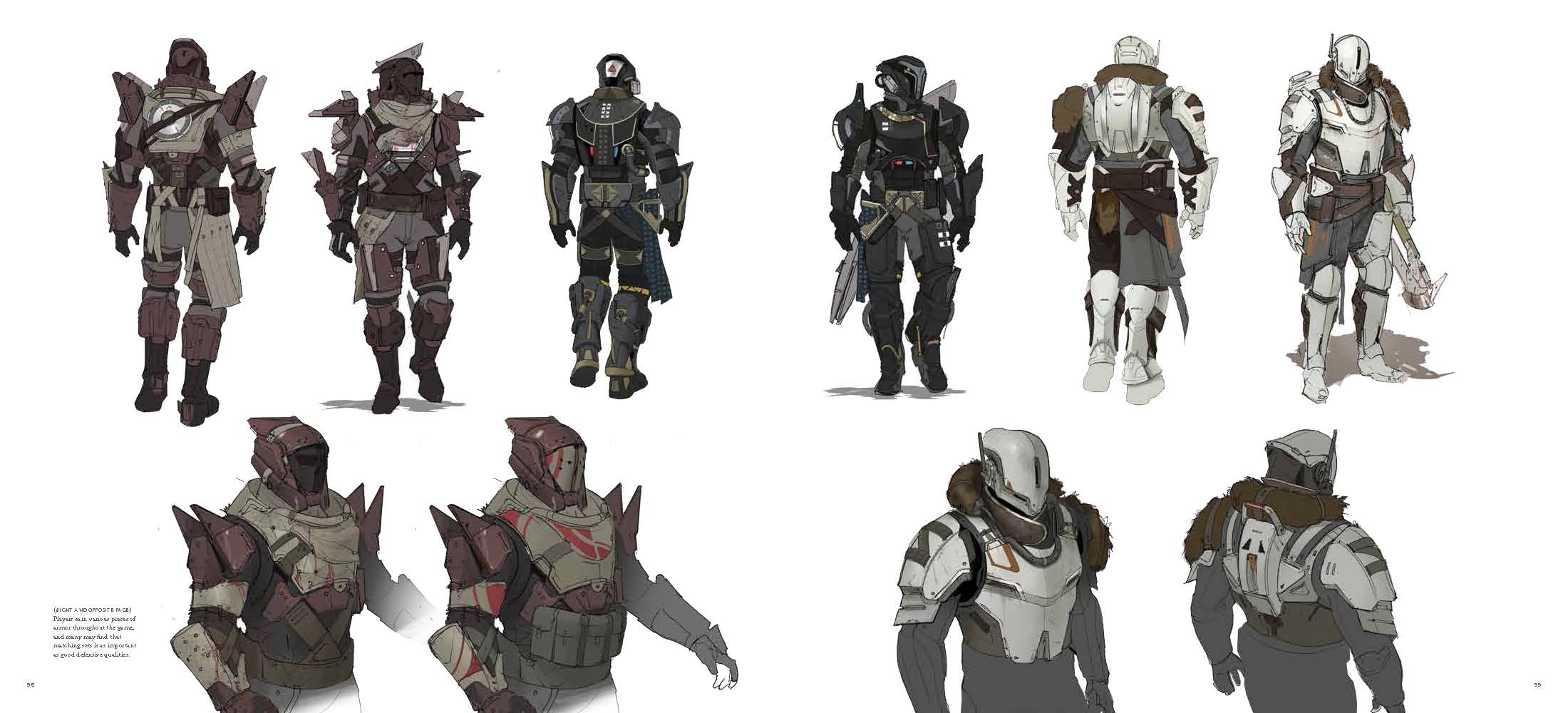
- Concept Art Graphics
Concept art is “the initial design used to
develop the look and feel of a project.” (http://artistryingames.com/concept-art-concept-art-important/). It’s all the ideas that you
have before you start creating certain aspects in a game (or film, comic book,
etc...) such as: the characters, the background, the location, the environment,
etc. You can get these ideas - and advance in your project – from a simple
drawing, or a model, or even something you’ve seen in a film for example.

What is graphics specifications?
The word specification can have different meanings:
- Client Needs
What are the client requirements, what was asked for you to create - what is the client brief.
- Audience
How are you going to create the digital graphics according to the audience/towards the target audience. For example, if you're creating graphics for a new Sonic game, you won't include any major violence in the graphics because it's just not appropriate.
- Thumbnail sketching
Thumbnail sketches are used to describe a small drawing on paper used to explore multiple ideas quickly.They are similar to doodles, but may include as much detail as a small sketch.
- Visual style
Photo-realism: Photorealism is the kind of art where the artists try to
make things look realistic, from the scenario to the characters, sound and
storyline, graphics in general, etc. Photorealistic graphics are designed to
look as realistic as possible. For example: the game “Until Dawn”, has a
photorealistic style, especially although not only the graphics, but also sound
and storyline. As we can see the character Sam from the game, she looks pretty
much real on the cape. In this picture we can clearly see the facial traits and
features of Sam’s face (Sam is the woman in the picture), and we can clearly
get to a conclusion that they look quite realistic.
Cell-shading: Cell shading is a type of style which makes 3d models look
hand drawn. Similar to photorealism and exaggerated styles, cell shading is the
kind of style where the artist try to make things not look very realistic, but
also not exaggeratedly abstract or cartoonish – this style is based on drawing
cartoon characters or/and scenarios, although not with too much fantasy around
it – it is basically mainly used to mimic (or create new) cartoons or comics.
For example: the game “The Walking Dead” is a cell shading game because the
graphics look kind of cartoonish and hand-drawn, plus they don’t look very realistic
or too abstract/exaggerated. In this image, if we look at the characters or/and
the grass, we can clearly tell that they were hand-drawn and they don’t look
very realistic at all.
Abstraction: Abstract
style can often be defined as the opposite of realism and/or the photorealistic
style. This type of art does not strive to resemble realism at all, and
normally has a lot of features that are quite unrealistic – abstract – and may
have different looks from different perspectives (as in different people read
these features in different ways). The abstract style normally uses a lot of
colours, lines and shapes, although it doesn’t mean that it resembles any
objects in real life. Take in mind that an abstract style doesn’t necessarily have
to use colours, lines or shapes to still be within that style. For example: the
game “Geometry Dash 2.0” has an abstract style since it has a lot of shapes and
colours. As we can see in the image below, the game has a lot of different
shapes and colours as I said before, making the game look quite strange, random
and abstract. We can see that the shapes don’t really represent anything in
real life, it’s just a style.
Exaggeration: This
style is quite similar to the abstract and cell shading styles – you can even
call it a mixture of both. It consists in over-the-top graphics, and it’s based
a lot on fantasy. You can also say that this style is literally the opposite of
the photorealism style, as normally everything in these types of games are just
not realistic at all. Normally, this style uses a lot of colours and a lot of
light, as well as exaggerated details in general, such as physical traits. A
good example of exaggerated style games would be the MMORPG genre in general –
so games like “Aura Kingdom” and “World of Warcraft”. In the image below, we
can see all the lights and colours that identify the exaggerated styles in
this game.
- Composition
- Environment Composition - It's the big picture - everything that the player can see. You can compose single
corridors and rooms, towns, landscapes, far horizon views and stunning
backgrounds. That kind of composition is often seen from only few directions,
that makes planning of the composition easier.
- Visual Feedback & Navigation - Highlight the
objective, show the way to the objective, guide the player through a specific
area. If the player's objective is to get to the chopper and you need
to navigate the player there or you simply want to show the player
where he should go then you can apply composition rules to highlight something
that will catch his attention and change his wandering course.
A common technique for composition, is the rule of thirds. It attracts the viewers attention to a certain point in the picture.
- Typography
Another way for a video game to look appealing and creative, is by using a typography styles.
"Video games have also been known to use many forms of typography,
to relay atmosphere or a timeline in the cut scenes or the gameplay itself. Its
uses are varied but with it game-makers can greatly enhance the experience or gameplay." -
- Technical Considerations
To meet the client brief requirements, you must also take in mind some technical considerations, such as:
- File format
- Optimization
- File Naming conventions
- Asset management
- Intended output
For example, you may want to use different file formats for different tasks within the client brief.


No comments:
Post a Comment